In 2025, mobile-first e-commerce isn’t just a smart idea—it’s a business imperative. More than 70% of online shopping now takes place on mobile devices. Yet many e-commerce sites still struggle with slow load times, clunky interfaces, and poor mobile UX.
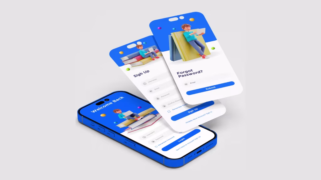
Enter Jurysoft, a Bangalore-based e-commerce development company that specializes in creating high-performance, mobile-optimized online stores. With a blend of technical precision and intuitive design, Jurysoft helps brands deliver frictionless shopping experiences—right in the palms of their customers.
Why Mobile-First Matters
Mobile-first doesn’t mean shrinking your desktop site to fit a smaller screen. It means designing and optimizing for mobile devices from the ground up, focusing on speed, clarity, ease of navigation, and conversion efficiency.
Shoppers today expect:
- Pages to load in under 3 seconds
- Navigation to be thumb-friendly
- Images to load clearly without delay
- Checkouts that are fast, simple, and secure
Jurysoft executes all of this—and more—through a combination of responsive design, image optimization, lazy loading, and performance tuning.
1. Responsive Design: One Store, All Devices
At the core of any mobile-first strategy is responsive design. Jurysoft creates e-commerce websites that automatically adapt to different screen sizes, ensuring that users enjoy a seamless experience whether they’re browsing on a smartphone, tablet, or desktop.
Key features include:
- Flexible grids and layouts that rearrange elements to fit smaller screens
- Mobile-friendly buttons and menus designed for thumb navigation
- Auto-scaling images and fonts to maintain visual clarity
With Jurysoft’s approach, users never have to pinch, zoom, or rotate their phones to interact with your store. Every site is clean, intuitive, and made to convert.
2. Image Optimization: Quality Without the Wait
High-resolution product images are critical to e-commerce success, but they can also slow down your site if not handled correctly. That’s why Jurysoft emphasizes image optimization from the start.
Their strategy includes:
- Using next-gen image formats like WebP and AVIF for faster load times
- Implementing responsive image loading with
srcsetto serve the right size for each device - Applying real-time image compression without sacrificing clarity
As a result, product galleries, banners, and promotional visuals load quickly and look stunning—no matter the device or connection speed.
3. Lazy Loading: Load What Matters First
To further enhance performance, Jurysoft leverages lazy loading across all e-commerce builds.
This technique:
- Delays loading non-visible images and media until users scroll near them
- Reduces initial load time and improves Time to First Interaction
- Helps Google Core Web Vitals scores—boosting SEO rankings
For mobile users with limited bandwidth or slow connections, lazy loading makes a dramatic difference in usability and engagement.
4. Performance Tuning: Speed = Conversions
Speed is more than a convenience—it’s a competitive advantage. A one-second delay in page load can reduce conversions by up to 20%.
Jurysoft ensures every store they build is performance-tuned for speed with techniques like:
- Minifying and bundling CSS, JS, and HTML to reduce file size
- Using CDNs (Content Delivery Networks) to serve assets closer to users
- Enabling GZIP compression and browser caching
- Code splitting and lazy script loading to reduce render-blocking
The result? Blazing-fast mobile stores that load in under 3 seconds and keep shoppers engaged from first click to final checkout.
5. Mobile Admin Tools: Power in Your Pocket
Being mobile-first isn’t just about shoppers—it’s also about sellers.
Jurysoft equips store owners with mobile-accessible dashboards that let them:
- Add or update products
- Manage inventory
- Track orders and view analytics
- Communicate with customers—all from a mobile device
With these tools, sellers stay agile and responsive, even while on the go.
6. SEO & UX: Mobile-First Indexing Done Right
Google now indexes mobile versions of websites first, which means that a poor mobile experience can damage your visibility—even if your desktop site is perfect.
Jurysoft ensures your e-commerce site is:
- Built with clean, mobile-friendly code
- Structured with proper semantic HTML and schema markup
- Fast-loading and Core Web Vitals optimized
- Designed for easy crawlability and indexation
This mobile-first SEO approach boosts rankings, drives organic traffic, and increases discoverability—especially for users searching from their phones.
Summary: Jurysoft’s Mobile Optimization Checklist
| Optimization Area | Jurysoft’s Implementation |
|---|---|
| Responsive Design | Auto-adapting templates, mobile-friendly UI |
| Image Optimization | WebP/AVIF, srcset, compression |
| Lazy Loading | Deferred image/video load for faster interaction |
| Performance Tuning | CDN, compression, caching, minification |
| Mobile Admin Tools | Mobile-accessible CMS, real-time updates |
| SEO & UX | Mobile indexing, structured data, fast loads |
Ready for a Mobile-First Future?
If you’re launching a new e-commerce site or upgrading an existing one, Jurysoft’s mobile-first e-commerce development services can help you stand out—faster, smarter, and optimized for how your customers shop today.
Let Jurysoft build the speed, responsiveness, and user experience your mobile shoppers expect. Because in today’s world, shopping happens anywhere—and your store needs to be ready everywhere.